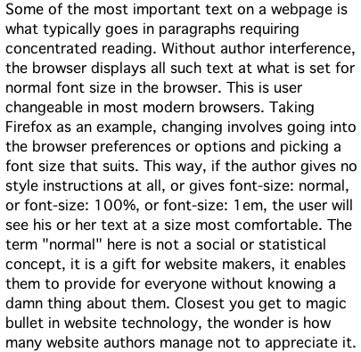
The following two pieces of text, one real HTML text, the other a picture of it taken on one of my monitors, are the same size for me on many, though not all of my Mac browsers. All of them have user Preferences (called Options in the Window world) that are set to display sans-serif fonts at 16px if the author does not explicitly rule otherwise.

Some of the most important text on a webpage is what typically goes in paragraphs requiring concentrated reading. Without author interference, the browser displays all such text at what is set for normal font size in the browser. This is user changeable in most modern browsers. Taking Firefox as an example, changing involves going into the browser preferences or options and picking a font size that suits. This way, if the author gives no style instructions at all, or gives font-size: normal, or font-size: 100%, or font-size: 1em, the user will see his or her text at a size most comfortable. The term "normal" here is not a social or statistical concept, it is a gift for website makers, it enables them to provide for everyone without knowing a damn thing about them. Closest you get to magic bullet in website technology, the wonder is how many website authors manage not to appreciate it.
You can start to see what I am seeing by trying to make both texts appear at least almost the same size. That gets you some way along the road to me. But there is further travel if you want to get closer. You need to change the resolution of your monitor to make each inch be 88.5px to see what I see on my 26" LCD or 113.3px each inch to see what I see on my 13" Mac laptop. Even so, you are still not quite there. You need a sans serif font to be showing. Got that set in your prefs or options for your browser? OK, but still not quite there! I am seeing a Geneva font, the one that has traditionally come with Macs from as far back as I can remember.
Lets suppose you have what I have in terms of fonts and resolution. There is one slight hurdle. What I see when I look at this page is four big pink rats crawling all over a bloke that has just been shot by Dirty Harry. No, only kidding! Don't you hate this kind of corny writing?
In my Google Chrome, iCab, Safari and even MacIE5 (!), I see the same. In FF5 and Opera the pic of the text and the text do not match. There is something I need to track down in FF - out of mere curiosity, not for any practical or important theoretical motive.