 Too often do we see text on web pages overlay other text or disappear altogether, not to say anything of other related frustrations. Mostly, the reason is that the authors have not sufficiently realised that their text is seen by people with different eyesights, different browsers, different user controls and settings. Webpages, of course, should be readable easily by all sorts of people. Many competent authors realise this but have various reasons and excuses for nevertheless producing pages with which people have trouble. I will come to these reasons and excuses shortly, but first let's look at some fundamentals, starting with how browsers decide what size to make text.
How browsers determine text size
 When you install a browser for the first time and go to a webpage like this one, the main body text will be a size that a lot of the seeing world will find comfortable enough, competent browser makers will have done their research to ensure this. And they generally do this via a preference or option setting, the browser shipping with some font and font-size setting but one that you can change. Whatever size setting is in this option we can call normal for that browser. I tend to set Geneva and 16px for my preferred font and size for sans-serif and 16px for serif too. This means that if no one is telling the browser otherwise, I will see main text on a monitor at 16px. So, browsers under my control quickly get 16px as normal if they are not already set that way. For you, it might be 14px. For the elderly lady and gent over there, it might be 18px.
In case you are wondering what 16px for a font-size means, it means roughly that the little block that the inventor of the font used to design the various characters is scaled to be 16px high and the designs of the characters are such that they mostly fit into this box, some going to the bottom of the box (using descender space), some going to the top (using ascender space). The box for all the characters needs to be the same height so that when laid side by side, the lines of text look neat and orderly. The designer of modern font families does not specify any particular size, it is just a box that is scalable, along with its contents.
So, the concept of normal is whatever is set in the browser for text. But what text? How about headings? What is normal for headings is not normal for paragraphs, so what is this normal? The answer is that all text is this normal and the same and as set in the preferences, unless someone says otherwise. Yes, that means all text, including headings, would be this normal in the absence of any stylesheet that says otherwise. How big a piece of text is a simple style matter, and style is the business, these days, of cascading style sheets, sets of style rules.
The reason top level headings are usually big and bold is that someone has told them to be - either the author or the stylesheet that ships with the browser. In the stylesheet that browsers default to unless overruled by the author of a webpage, the top level heading is often dictated to be twice as big as normal, 200% of what is normal for body text. The second level headings (like the word "Zooming" below) are set by me to be 150% greater than normal. But I have not set anything special at all for the text in ordinary sentences like this. I have let your browser decide. And the browser decides how I described. It is yours to tell it. Whatever is comfortable for you is normal. All non-body text is usually a percentage different from this baseline normal.
So, we each have our browsers and have them set for what is comfortable for us in the body text. But what happens when we come across a webpage where the author decides to make body text less (or more - though this is very rare) than what is normal?
What quite often happens is that we are annoyed and either strain our eyesight or fiddle to fix it by enlarging (or reducing) the text just for the page(s) we are browsing. In some older browsers, if the author set the font-size a certain way, users were unable to alter it, they had to lump it or leave it! Luckily, modern browsers give easy access to temporary controls. Temporary? Well, if you find the text on one website absurdly small, it would be a nuisance to go into preferences or options and reset the size you find comfortable by pretending you need much bigger than what you actually need in general. That would affect all the websites you visit. There is, thankfully, an easier set of handy controls for tactically changing a webpage's text sizes and that is what I will next describe.
Zooming
Some popular modern browsers have a magnification facility called zooming, where both text and images (foreground and background), at the same time, are enlarged or reduced. Many of the same browsers have an option for the more traditional type of control, just the text adjusting its size, not the images. So popular has the more modern zooming become that those browsers that do provide for text only size adjustment make it a turn off option. In other words, out of the box, these browsers use the full zoom, you have to tick or cross a preference or option menu to turn this off. It is not all that surprising that there would be some authors (and many users) not all that familiar with this Zoom Text Only option. Google Chrome in my latest version has dropped this Zoom Text Only option. Opera, now a very sophisticated browser, famously, has never had simple text only size change like Firefox and Safari.
Many regular visitors to websites know how to quickly enlarge the text for particular pages either by key command or simply mousing an option in a menu (often the View menu at the top of most browsers). You can quickly tell now whether you have the full zoom or the Zoom Text Only operating: change the size of your text and see if the relative length of the following two lines change. One is real HTML text, the other an image. On Text Only Zoom, the image will stay the same length and no matter what your normal text size setting, if the lines are not about equal to begin with, you should be able to make them roughly the same length. You do this by pretending to have worse or better eyesight and zooming in or out. If you don't know how to do this, the next paragraph should help.
Tactical (temporary) enlarging
Many browsers have menus to alter the size of the items (like text) on a webpage without having to go to strategic options or preferences (that set the parameters for all website viewing). They are often under a menu at the top of your screen called "View". One Mac browser called iCab has a rather instructive font-size submenu under its View menu, the essentials of which is illustrated here: 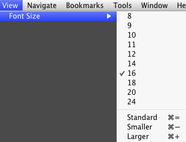 Notice that what we have been calling 'normal' is called 'standard' in this browser. The concept is the same. The reason this menu is instructive is that the size of the selected is marked with a tick. Clicking the standard button reveals the size that is set down in preferences/options and this size is the more strategic, permanent size that the browser defaults to when started up and you begin surfing every day. If you have set 16 for your normal but need to choose a bigger size for a particular page or site, you can revert to your generally preferred by choosing 'Standard' under the font-size submenu under View.
A bad webpage!
For me, the following two lines - the first of which is just text, the second a fixed 140px width bit map picture of text - are the same size at my normal text-size settings:
ABCDEabcde012345
And the following webpage mockup is without obvious faults at first sight at my end:

'....we make it look the same everywhere'
The size of the words in this paragraph were comfortable to read for the author of this pretend webpage; at a desk on a fairly new 26" LCD monitor with a resolution of 100px per inch; in browsers set to see normal text at 16px.
If this pretend webpage text is bursting out of boxes, generally overlapping other text, you can get an idea of how the author saw it by temporarily altering your text down in your browser. If you want to get an idea of how people who need bigger text than yourself see this pretend webpage, you can get an idea by temporarily altering your text up in your browser.
Long text links in many browsers (e.g. Safari) do not wrap. Here is a simulation of one: pixelbrigadecompany.com.au/. People with different eyesight to the author might see the link text bursting the box which the author clealy thought would confine it.
If you can get the first of the following two lines to be equal to or less than the second, you will probably not be seeing any trouble like text disappearing or over-running other text:
ABCDEabcde012345
At this size on my machine, it looks OK, no text is overwriting any other text, no text is disappearing, everything is in the areas I made for them. To see this, if you are not already seeing this, temporarily alter your text size to make the two lines mentioned agree roughly in length and see for yourself.
If you have bigger than 16px set for font-size, you will probably find your rendition of the above four paragraph blocks in the pretend website a mess. In fact, for those people who require only a bit more size for their normal text, the text in the boxes would start to overlap, overflow, get cut off and generally be annoying and confusing.
The reason this happens in particular in this case is that the blocks are widthed and heighted in pixels. At font-size 16, the text pretty well stays in the boxes. But there is no way that this vector text can be guaranteed to be contained by a box dimensioned in pixels because in the browsing situation, the size of a pixel on a monitor is a fixed quantity whereas the size of text (under Zoom Text Only) can be anything the user chooses. These days, text for screens have no inherent best size, it is more like a tooled up little factory ready to produce whatever size is wanted.
If we use the modern facility of zooming where both text and pictures and pixel sized elements all grow, that is if we do not choose 'Zoom Text Only', the pretend website above is unlikely to have its text misbehave because the browser mimicks a bigger pixel for its unit. Thus everything gets bigger and everything stays in the same proportions - roughly speaking. A side of a box that normally takes up one inch on your screen might now take up two inches (and be thicker too). Now we can say that the line is drawn on your screen by more pixels or we can say that the same number of pixels are involved, it is just that they are bigger (virtual) pixels.
It sounds like this full zooming facility is a very useful thing and if everyone used it, there would be no complaints about text misbehaving. To some extent this is true and some browsers have simply dropped the Zoom Text Only facility. But the fact is that those of us who choose to use Zoom Text Only do so for solid reasons. We do not want to see degraded bitmapped images (which happens when they are spread over larger virtual pixels) and we do not want to do so much scrolling to see the content, especially, horizontal scrolling.
The good thing about most lines of text is that they wrap and generally within the viewport and so no horizontal scrolling needs be involved because of mere text size enlargement. But some browsers that do not have Text Only Zooming (as the iPad's Safari seems not to have!) can cause quite annoying need for horizontal scrolling).